In today’s competitive digital landscape, a landing page isn’t just a digital brochure—it’s a conversion engine. Whether your goal is lead generation, product sales, or sign-ups, the difference between a high-performing landing page and one that fails often comes down to strategic design choices. Let’s break down the most effective landing page design strategies that truly convert visitors into customers.
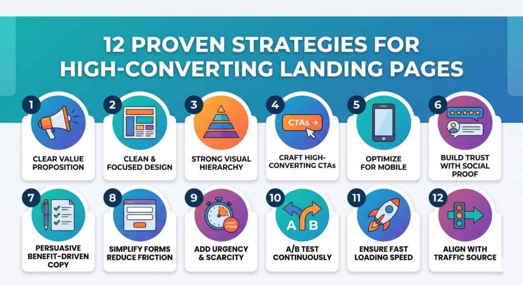
1. Start with a Clear and Compelling Value Proposition
Your value proposition is the first thing visitors should understand within seconds of landing on your page. It answers one key question: “What’s in it for me?”
Use a strong headline paired with a concise subheading that communicates your unique selling point. Avoid generic phrases—be specific, outcome-driven, and customer-focused. For example, instead of saying “Best Digital Marketing Services,” say “Increase Your Website Leads by 3X in 60 Days.”
2. Keep the Design Clean and Focused
A cluttered landing page confuses users and reduces conversions. Minimalist design is not just about aesthetics—it improves usability and clarity.
Stick to a simple layout with enough white space, consistent typography, and a limited color palette. Remove unnecessary navigation links that can distract users from your primary goal. Every element on the page should support one action: conversion.
3. Use Strong Visual Hierarchy
Visual hierarchy guides users through your content in a logical flow. By strategically placing elements, you can control where users look first and what actions they take next.
Use larger fonts for headlines, contrasting colors for call-to-action (CTA) buttons, and structured sections to break content into digestible chunks. Important elements like CTAs should stand out instantly.
4. Craft High-Converting Call-to-Action (CTA) Buttons
Your CTA is the most critical element on the page. A weak CTA can ruin an otherwise well-designed landing page.
Use action-oriented and benefit-driven language such as:
- “Get Your Free Quote”
- “Start My Free Trial”
- “Download the Guide Now”
Also, make sure your CTA buttons are visually prominent. Use contrasting colors and place them strategically—above the fold and throughout the page where necessary.
5. Optimize for Mobile Users
With a majority of traffic coming from mobile devices, a mobile-friendly landing page is non-negotiable.
Ensure fast loading speed, responsive design, and easy navigation. Buttons should be thumb-friendly, text should be readable without zooming, and forms should be simple to fill out on smaller screens.
6. Build Trust with Social Proof
Trust is a major factor in conversion. Visitors are more likely to take action when they see evidence that others have had a positive experience.
Include:
- Customer testimonials
- Case studies
- Reviews and ratings
- Client logos
- Certifications or awards
Real images and authentic quotes perform better than generic placeholders.
7. Use Persuasive and Benefit-Driven Copy
Your landing page copy should focus more on benefits than features. Instead of listing what your product does, explain how it solves the user’s problem.
Use simple, conversational language and break content into short paragraphs and bullet points for readability. Address pain points directly and position your offering as the solution.
8. Simplify Forms to Reduce Friction
Long and complicated forms can discourage users from converting. The rule is simple: ask only for what you truly need.
For lead generation, basic details like name, email, and phone number are often enough. You can always collect more information later in the funnel. Also, use clear labels and avoid unnecessary fields.
9. Add Urgency and Scarcity
Creating a sense of urgency can significantly increase conversions. When users feel they might miss out, they’re more likely to act quickly.
Use elements like:
- Limited-time offers
- Countdown timers
- Limited stock messages
- Exclusive deals
However, ensure that urgency is genuine—false scarcity can damage trust.
10. A/B Test for Continuous Improvement
Even the best-designed landing pages can be improved. A/B testing helps you understand what works best for your audience.
Test different variations of:
- Headlines
- CTA buttons
- Images
- Layouts
- Colors
Small changes can lead to significant improvements in conversion rates. Always rely on data rather than assumptions.
11. Ensure Fast Loading Speed
Speed plays a critical role in user experience and SEO. A delay of even a few seconds can increase bounce rates drastically.
Optimize images, use efficient coding practices, and leverage caching techniques to ensure your page loads quickly across all devices.
12. Align Landing Page with Traffic Source
Consistency between your ad or link and landing page is essential. If a user clicks on an ad promising a specific offer, your landing page should deliver exactly that.
Mismatch in messaging can confuse users and lead to higher drop-off rates. Maintain message consistency in headlines, visuals, and offers.
Final Thoughts
A high-converting landing page is not about flashy design—it’s about clarity, relevance, and user experience. By focusing on a clear value proposition, clean design, persuasive copy, and continuous optimization, you can turn your landing pages into powerful conversion tools.
Remember, successful landing pages are built with the user in mind. The easier and more compelling you make the journey, the higher your chances of converting visitors into loyal customers.
FAQs
A landing page is a standalone web page designed for a specific marketing goal, such as generating leads or driving conversions.
Good design improves user experience, builds trust, and increases the chances of visitors taking the desired action.
Clear messaging, strong CTAs, minimal distractions, fast loading speed, and mobile optimization all contribute to higher conversions.
It depends on the page length, but generally one primary CTA with a few repeated placements works best.
There is no fixed length. Short pages work for simple offers, while detailed pages perform better for complex products or services.
Very important. A large percentage of users browse on mobile devices, so a responsive design is essential for conversions.
Yes, testimonials build trust and credibility, making users more likely to convert.
High-quality, relevant images that support your message and connect emotionally with your audience perform best.
Use A/B testing, analyze user behavior, improve page speed, and continuously optimize design elements.
Avoid clutter, too much text, slow loading speed, confusing navigation, and weak or unclear CTAs.